Example Component Styles Document
| Component | Class Name | Class Value | Screenshot | Comments |
|---|---|---|---|---|
| Accordion | 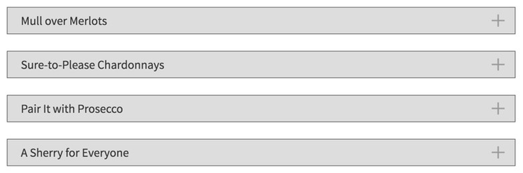 | |||
| Breadcrumb | 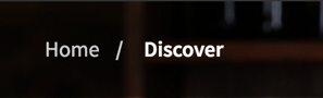 | |||
| Button |  | |||
 | ||||
| btn-reds |  | |||
| btn-whites |  | |||
| btn-bubbles |  | |||
| btn-dessert |  | |||
| Carousel | 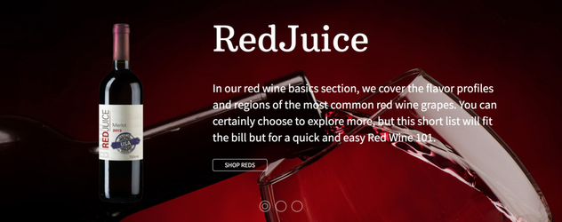 | |||
| Hero | 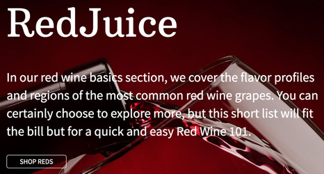 | |||
| Highlight | ||||
| Horizontal | highlight-horizontal |  | ||
| Carousel Highlight Left |  | |||
| Image | Region Flag | region-flag |  | |
| Image Overlap | img-overlap |  | ||
| Full width hero |  | |||
| Lead |  | |||
| Month Black | month black |  | Calendar image is not content editable | |
| Month Red | month red |  | ||
| Section Header | 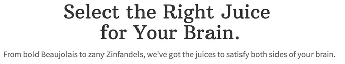 | Placed inside of a center text panel | ||
| Section Hero | 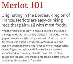 | |||
| Section Menu | 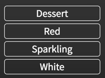 | Placed inside of style box with background color | ||
| Stripe | ||||
| Structure | Wide Left 9-3 | 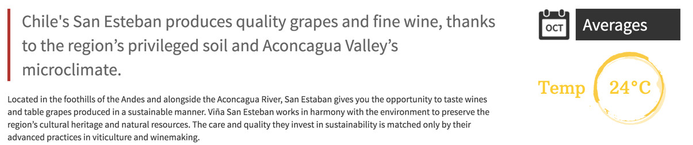 | ||
| Wide Left 10-2 | 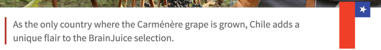 | |||
| Style box | Home Bottles | home-bottles | 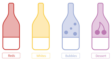 | Image buttons placed inside |
| Region Detail | region-details | 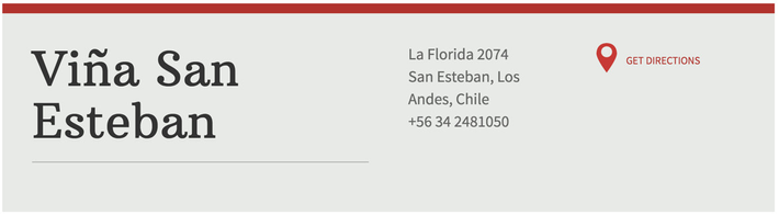 | Has a background color for the border, and a nested style box for the background color All components inside are styled in context of this style box | |
| Highlight Discover | highlight-discover | 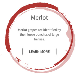 | Uses a background image with background style 'contain' | |
| Top Border | border-top | 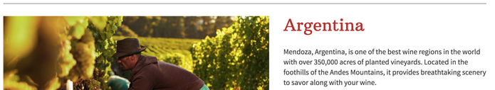 | ||
| Product Snippet | product-snippet | 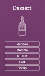 |